| Robot Wants To Buy It All | 03:50 PM -- Fri May 18, 2018 |

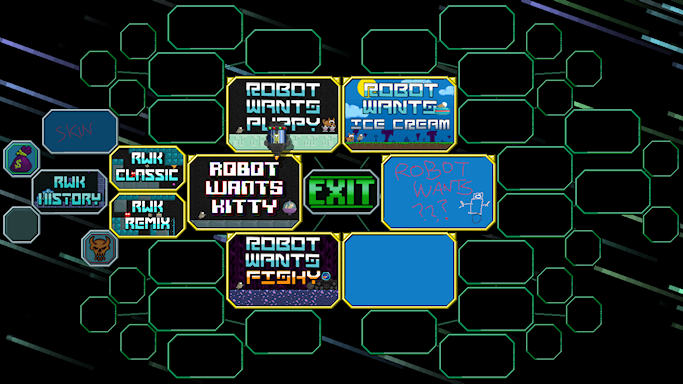
This week, I got really down and dirty in the code and artwork for robot's shopping experience. I wanted to make something a little different. It's not that different - it's still just a bunch of icons and each one costs a certain amount of money (not real money! Toy money! No IAP), and you click to buy. There is a "tree" to it, like a skill tree, where you need to buy certain things before other things, but you have the freedom to work your way around pretty much how you like. The idea of the tree is that it's more exciting to progress towards what you want instead of seeing a list of everything imaginable and just picking your favorite (fun at first, and then progressively more dull as the remaining options are less and less appealing!).
I also spent some time considering a Mortal Kombat style shop. I'm really fond of the Krypt system they had in that game - all the items are there to purchase, but you don't know what they are until you buy. It's kind of like gambling, but you always win (just not always as much as you had hoped). That's still an option here, but I think we'll stick with knowing what you're buying. I'm still going to keep the items that are not available to buy secret until you unlock them though!
I also thought about having some items locked behind achievements or other goals. That's still on the table, we'll see.
I'm proud of how this incredibly massive layout looks - it's like some weird alien space object made of TVs. Just the layout makes it almost like there's a fisheye effect going on, it's almost an optical illusion where the stuff in the edges seems to curve away. It also does a cool animation when it loads in, which my Twitch viewers know about (Check me out there on Tuesdays and Thursdays if you want sneak peeks of this game! Also on Saturdays I stream playing games).
Fun fact: the cursor is Kitty inside an ejection pod. We've got full controller support in this game, which is tricky on this screen... no easy way to navigate that noise with a controller, so I just copped out and made the controller move the cursor around. That's always a little clunky to me, but it's just for this screen. Our other menus function in the traditional up/down/left/right system from days of NES past.
Now the real question is what to do with that extra space on the edges of the screen... oh yes, I have ideas. We can't waste a single pixel of potential metagame!
| 7 comments | Back to top! |
Copyright 2021-2025, Hamumu Games Inc.

